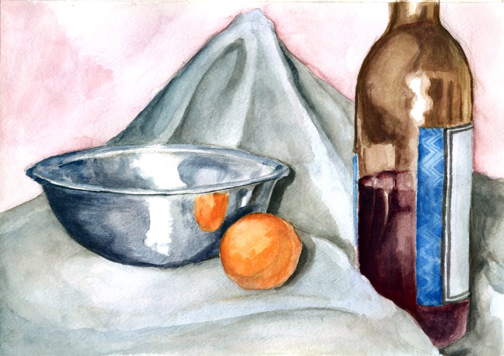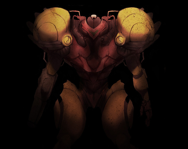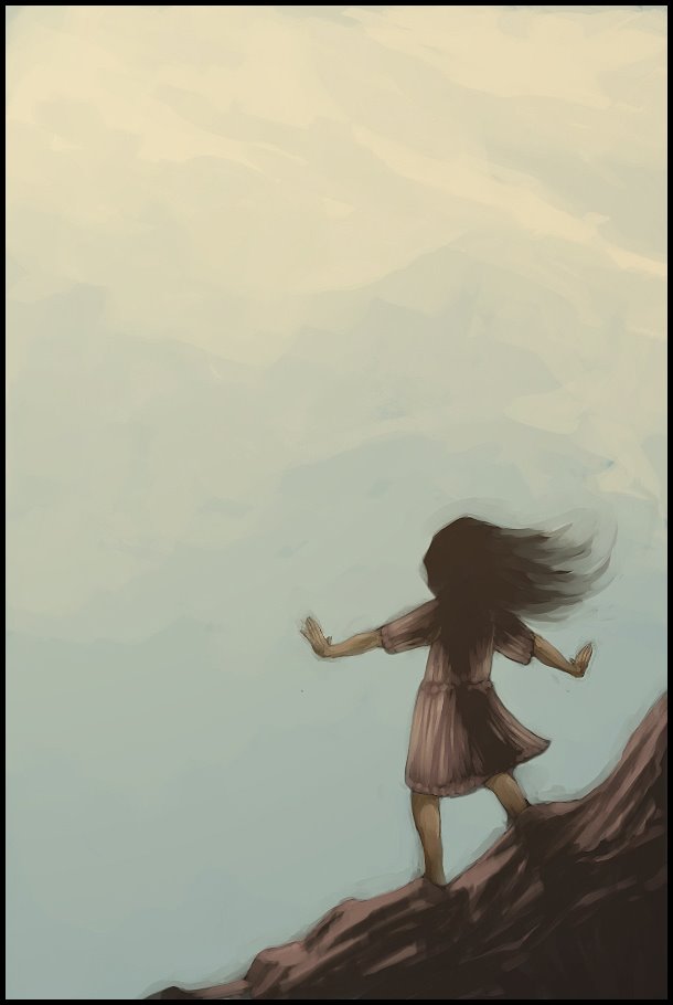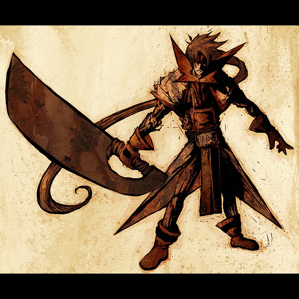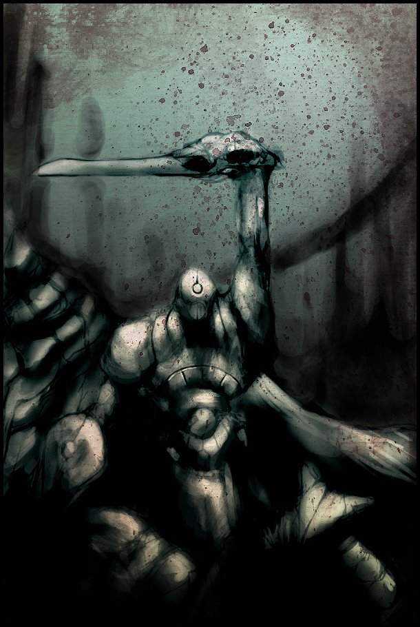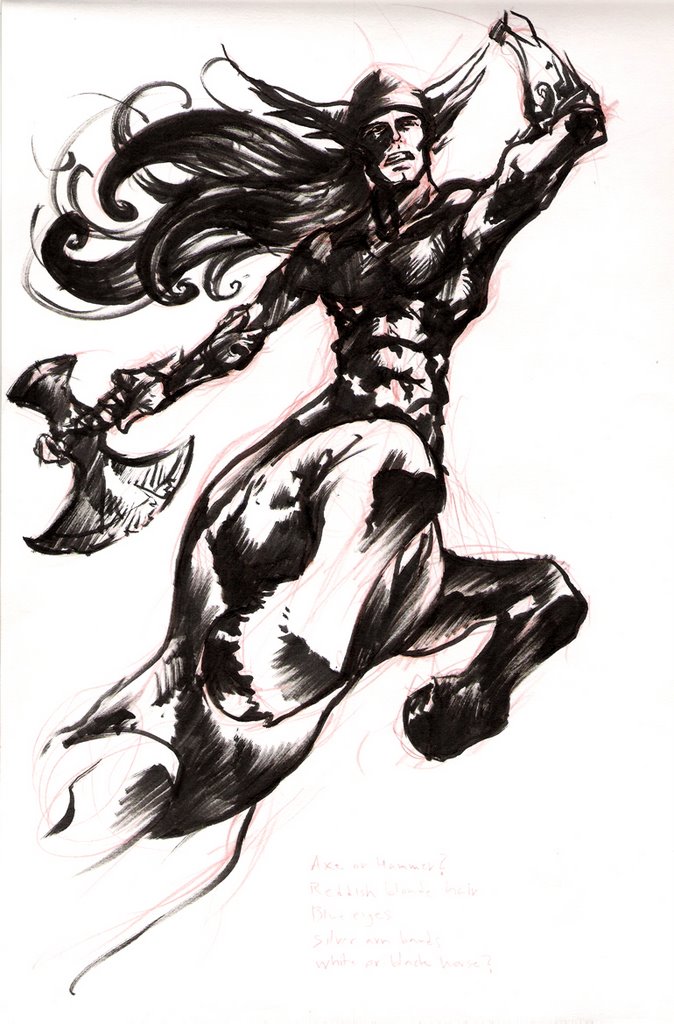
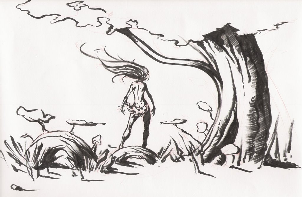

Cheated on the third one and used a micron for some of the details...

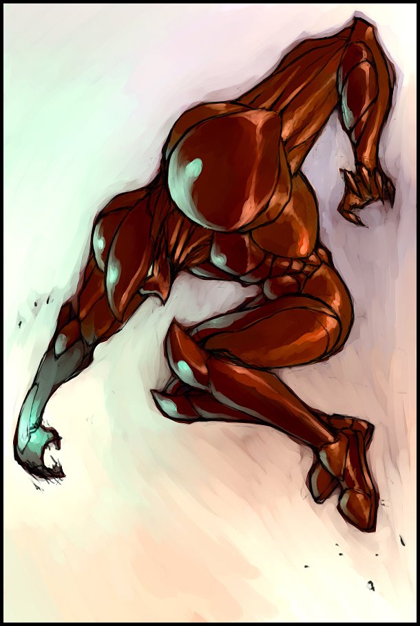
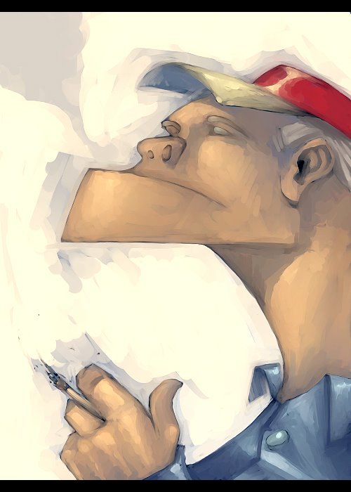 With this one I was trying to mix a cartoony style with a painterly look. I've been trying to get away from being too realistic.
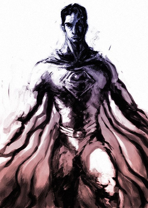 I loved Superman's character in Superman Returns. I thought Bryan Singer did an excellent job at capturing what Superman is all about. Truth and Justice. He was so calm, focused and powerful... He was amazing.
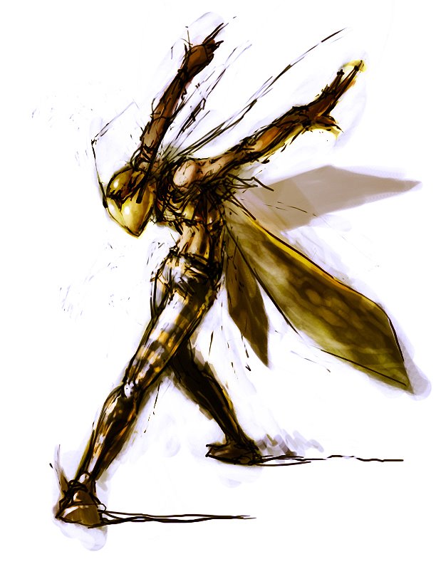
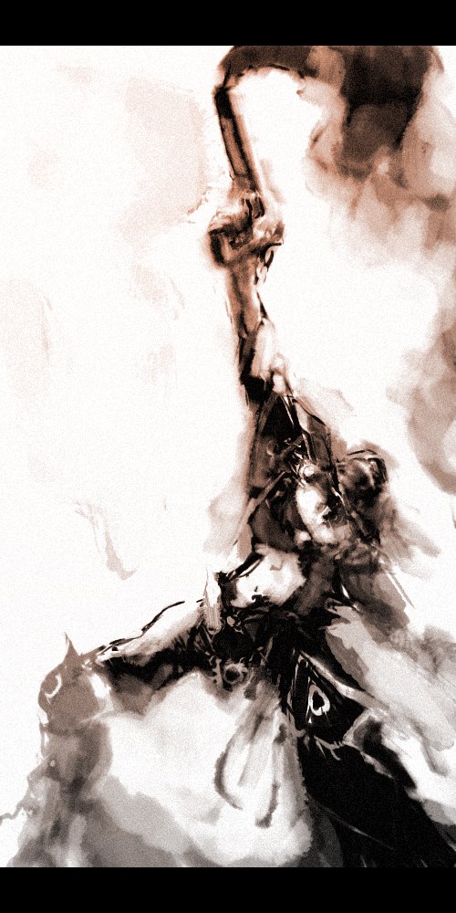 I was trying out tweaking with the different brushes in PS7. Unforunately I don't remember how I got the brush I did this image with. I like keeping things loose. It's hard to get dynamic images. I need to keep looking to my favourite artists for inspiration. Maybe this problem would be resolved if I went to life drawing more often...
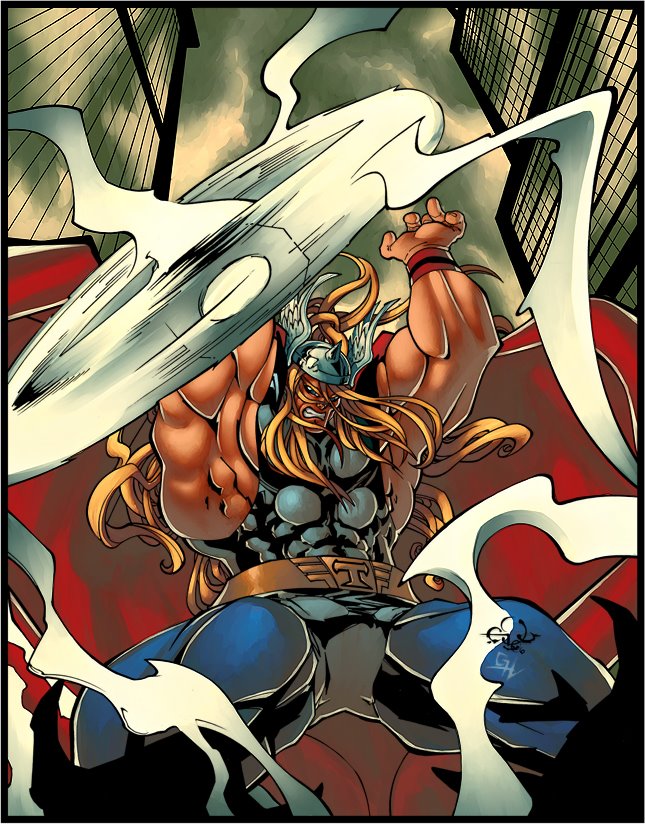


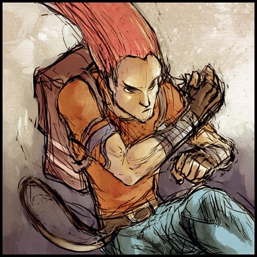
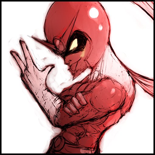


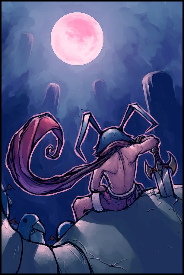

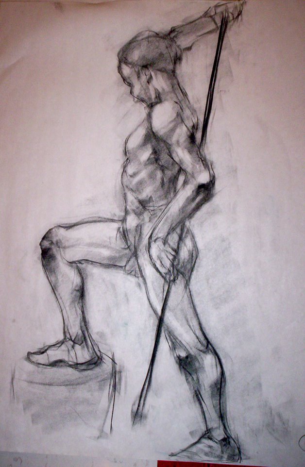
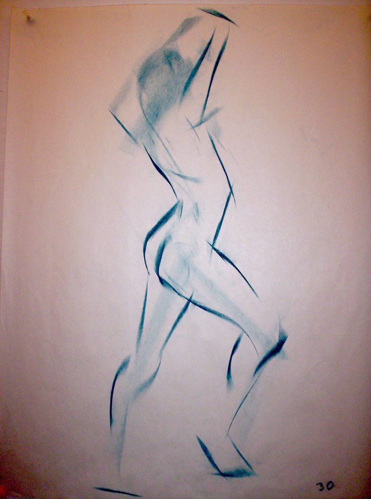 1 Minute
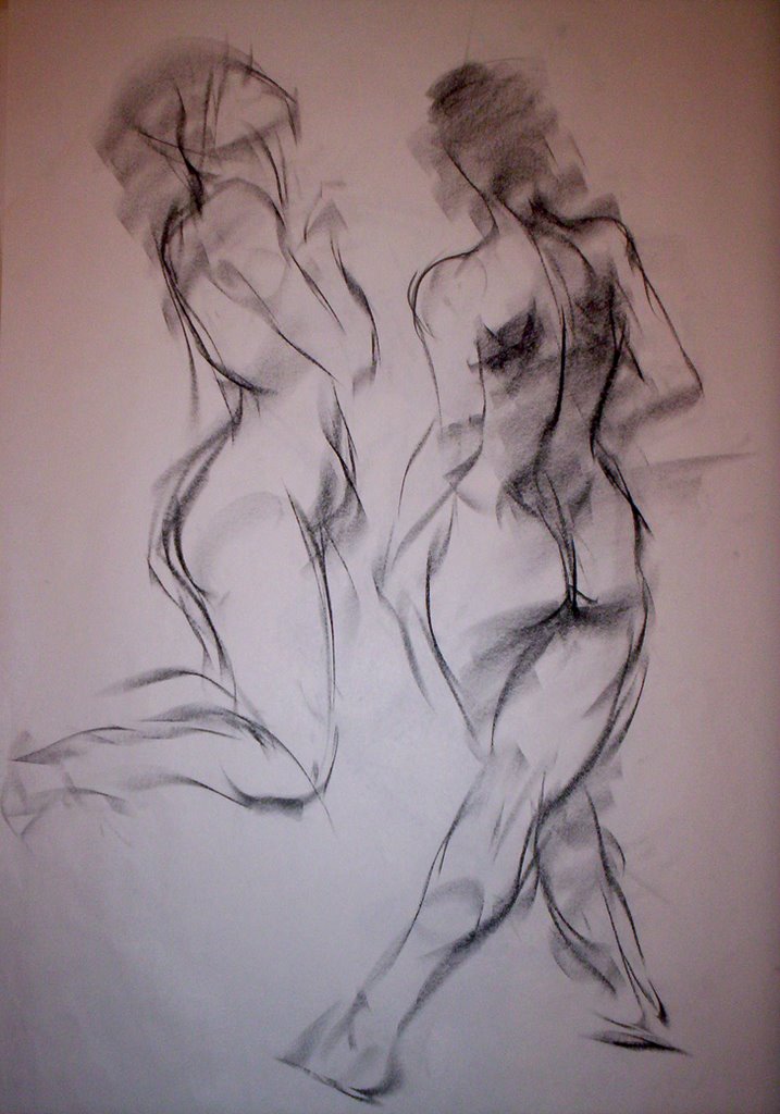 2 minutes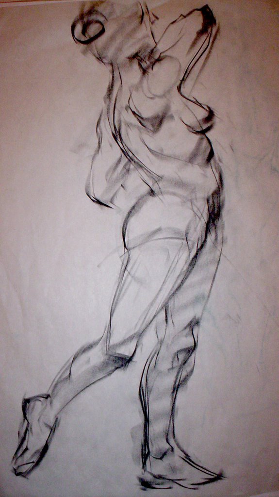
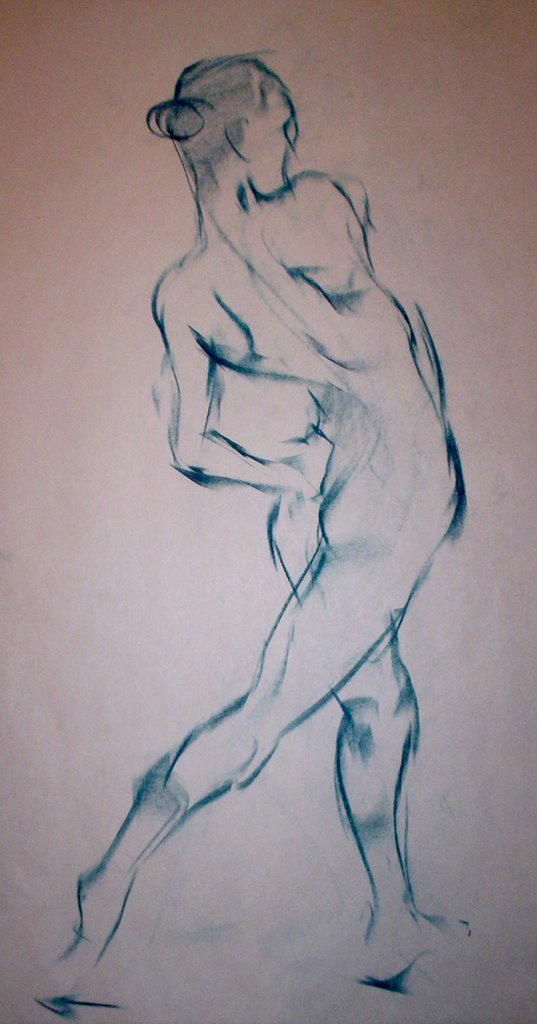
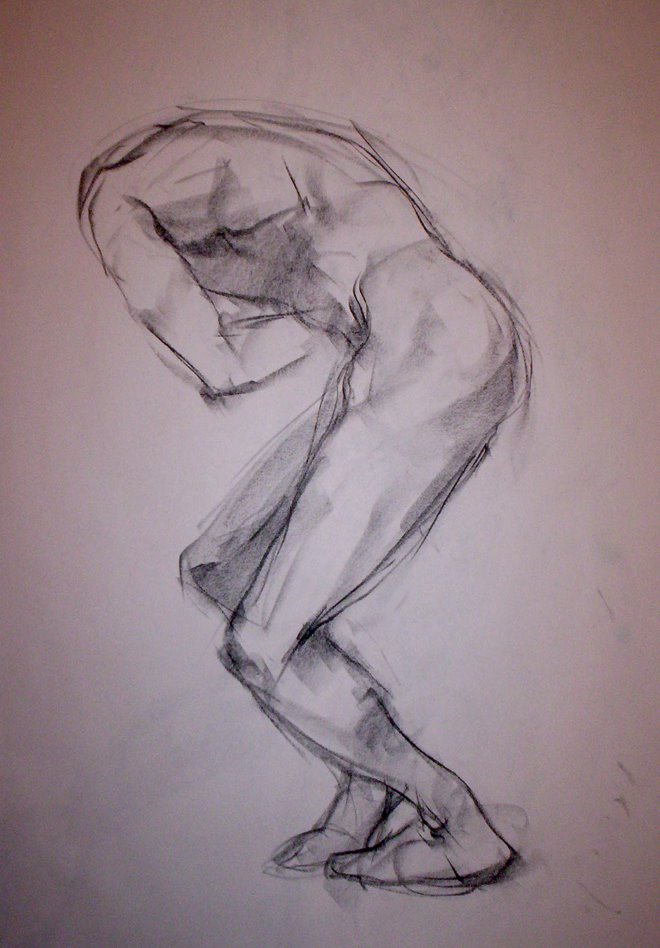 5 minutes

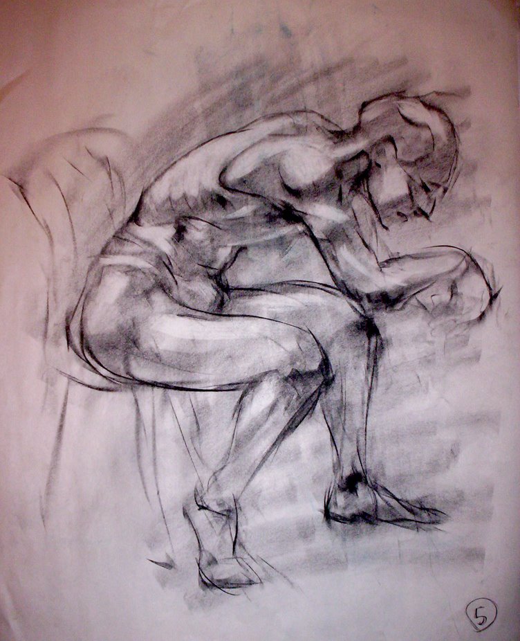
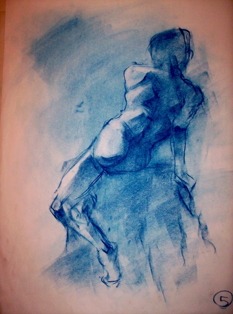 10 minutes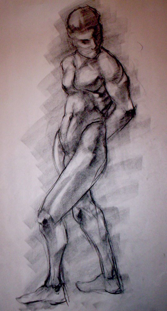
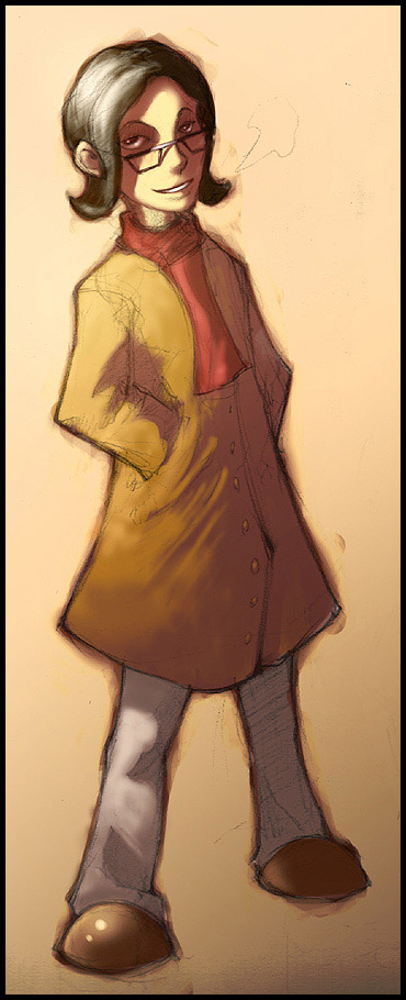
 Awwwwww. Isn't she CUTE!!!??? In a sort of creepy, bug eyed, "I'm not human" kind of way??? I don't really consider myself an anime artist. I grew up watching Ranma 1/2 , Dragonball Z, Pokemon, etc. etc. And I use to draw it all the time but I was never really good at it and the more I grew, the more I realized it just isn't for me. It's definately had a huge influence in my style, and therefore I respect it... Most of it... As for the picture, I wanted to try anime again. Always good to try something different ;) Ever since I played Disgaea, my style changed A LOT. So whenever I do something anime-esque, I think Harada. Which I'm cool with, I love the guy.
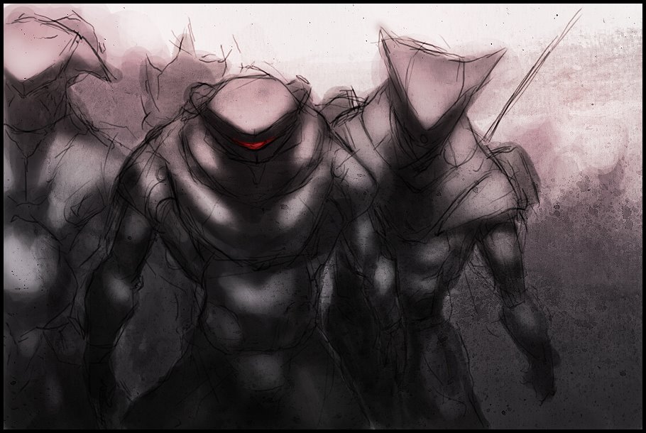
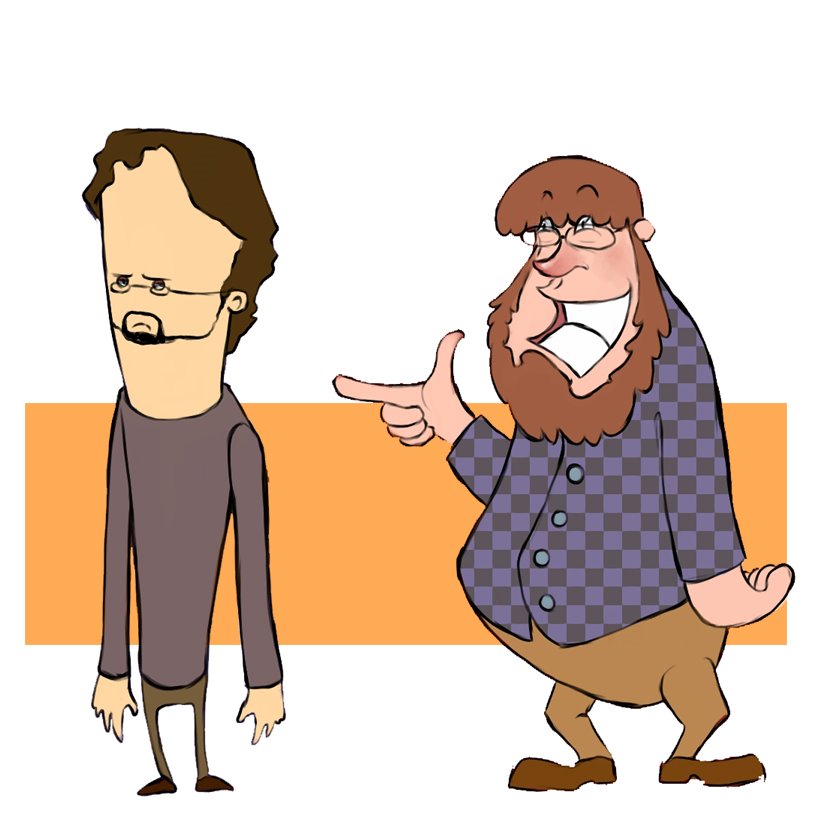 These are some preliminary character designs for a short flash animation my friend and I want to do over the summer. Once again, I'm trying to back away from my typical stuff and do something new. I don't really care if it looks amazing or not, I'm just trying to push myself in different directions... The characters aren't very structured but I can always make them structured later. Also the quality of the pic is kind of bad but that's my laziness. It's not a masterpiece anyway :P
 Well here's the final piece I did using the texture from my previous post. I'm pleased with it. Did most of it in photoshop. all the rendering of the two figures was done in Open Canvas 3.
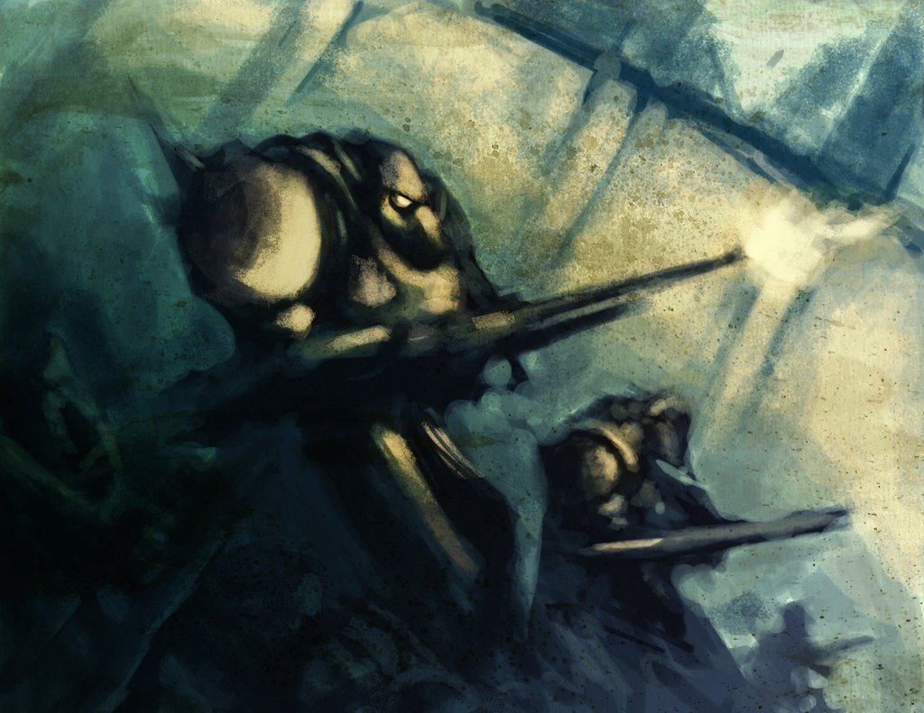 This is a piece I did to test out a texture I made. I have a cool picture in mind of how I'm going use this style so I did this to see if I could pull it off basically. I was happy with the result. It isn't finished but it doesn't have to be.
 I started out by doing a quick sketch of the Angel on the tree in Photoshop. I do this because I find that by doing the rough stuff first I can get the pose right along with the composition and whatnot easier than by going straight into the image with colour. If I start out doing a piece with colour I tend to make things look stiff. That's just my inexperience with the medium though. Plenty of people create beautiful pieces by getting right into the colour at the beginning.
 I then save the image and load up Open Canvas. I like Open Canvas for digital painitng better than photoshop because of the watercolour tool. The watercolour tool in Open Canvas really has a nice feel to it that I've grown comfortable with over the years... But anyway I set the image to multiply layer and colour the lines I have. At this stage the colouring is rough. This is because I am trying to figure what looks nice and what doesn't colourwise.
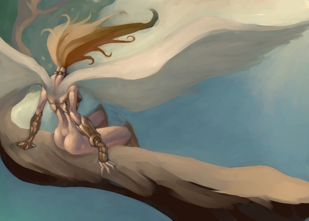 After I have everything coloured the way I want it I flatten the image so no more layers. Everything is on one layer now. I go over all the black lines with the water colour tool to give it a more painterly look. This part is tedious but rewarding :D
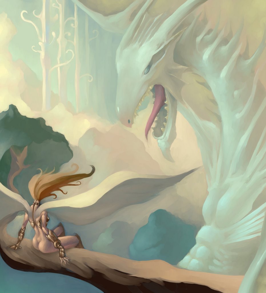 Now technically the piece could have been finished but I decided to add a dragon in there to make things more interesting.
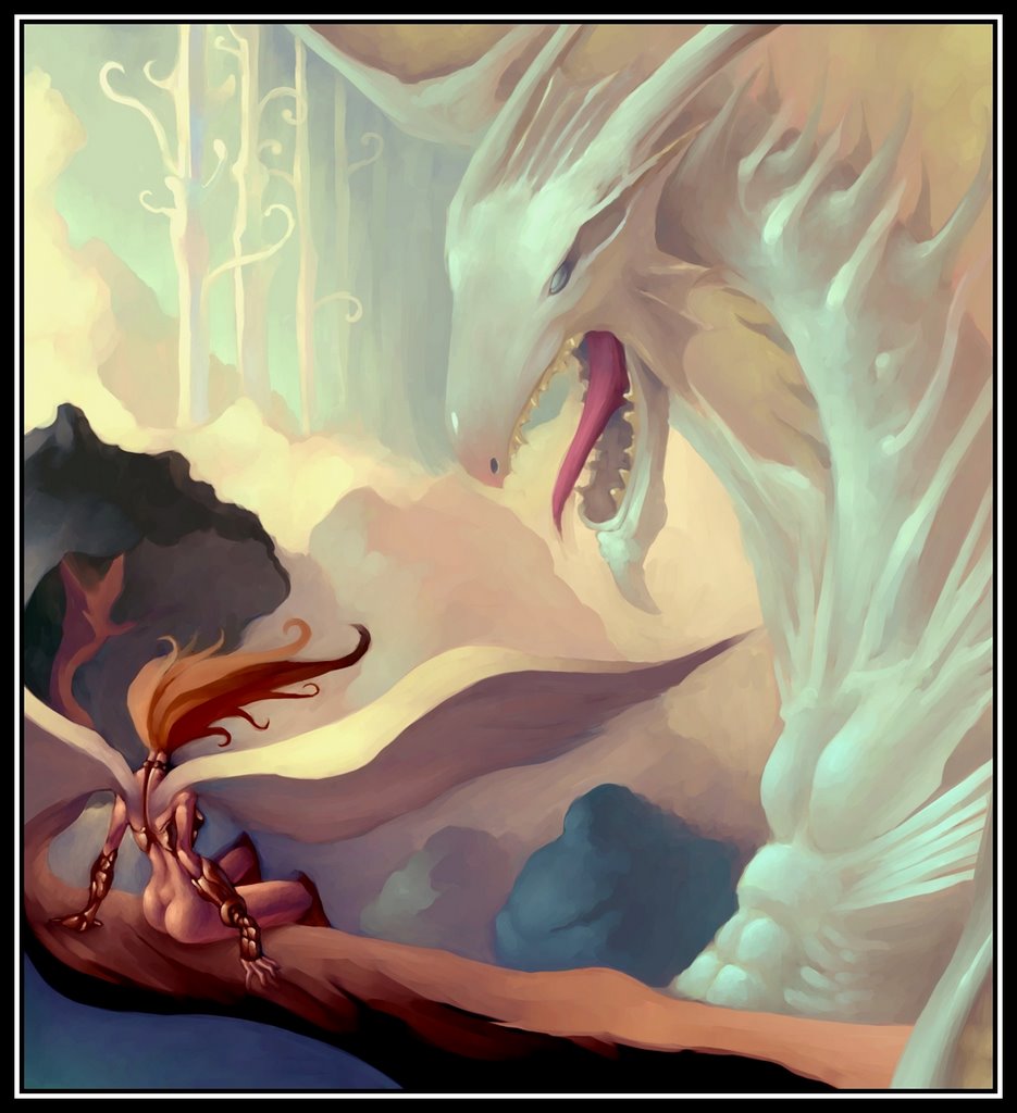 After getting all that done I put it in a nice little frame and adjusted the colour balance because I felt the colours could have been stronger.